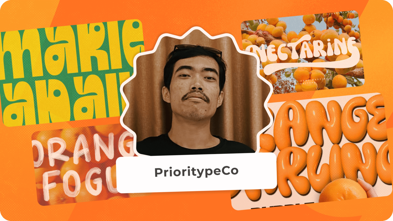
Today’s interview is with Prio, the founder and talented font designer behind PrioritypeCo. Read on to discover his background, what he loves about font design, and the creative process he goes through to design a font!
To other graphics Authors on Envato, I’d say: let’s keep the quality up together and always keep improving!
Prio Nurokhim Aji AKA PrioritypeCo
Background
Hello, let me introduce myself! My name is Prio Nurokhim Aji, but I usually go by Prio. I’m a type designer and also the owner of the Prioritype Co foundry. I live in Kebumen in Indonesia.
I started my career in type design by first noticing and appreciating the world of typography. Once I had acquired a passion for it, I studied theory online and started going to events with local type foundries to exchange ideas in person.
How did you get started creating on Envato?
I first wanted to start creating to sell on Envato because I saw that it was such a large platform with so many high-quality graphic assets.
Once I got here, I discovered why the standards are so high. I have been pushed and tested to create the highest quality assets I can.
I really enjoy being an Envato Author because it pushes me to get better and to learn more about creating high quality products.
Tell us about your team
The team is me! For now I am still a single fighter, with no one else behind me, but maybe someday my business will grow to the point where PrioritypeCo is a bigger team.
Font design
What is your process for designing a font?
I start designing fonts by looking at different references on various platforms, including social media. That helps me to get my broad inspiration from observing and taking note of the things around me every day.
Once I have that, I start to narrow down the scope by working out what I want to make next. This could be as simple as the type of font (e.g. display, serif).
Put it this way: I don’t make anything I’m not interested in!
To understand the kind of shapes the font will have, I start sketching out some ideas. This can either be with paper and pen, or sometimes digitally. I keep refining my sketches until they’re what I would consider ‘mature’.
Then, I begin the vectorization stage. For this, I use the program FontLab. After all the sketches have been vectorized, I continue with the matrix and kerning settings and decide on the features I want to include.
After the font creation is finished on FontLab, I export it and start to test it out. If it matches what I am expecting, I proceed to the final stages. The final stages include a cover and previews to show what kind of designs the final product is suited for.
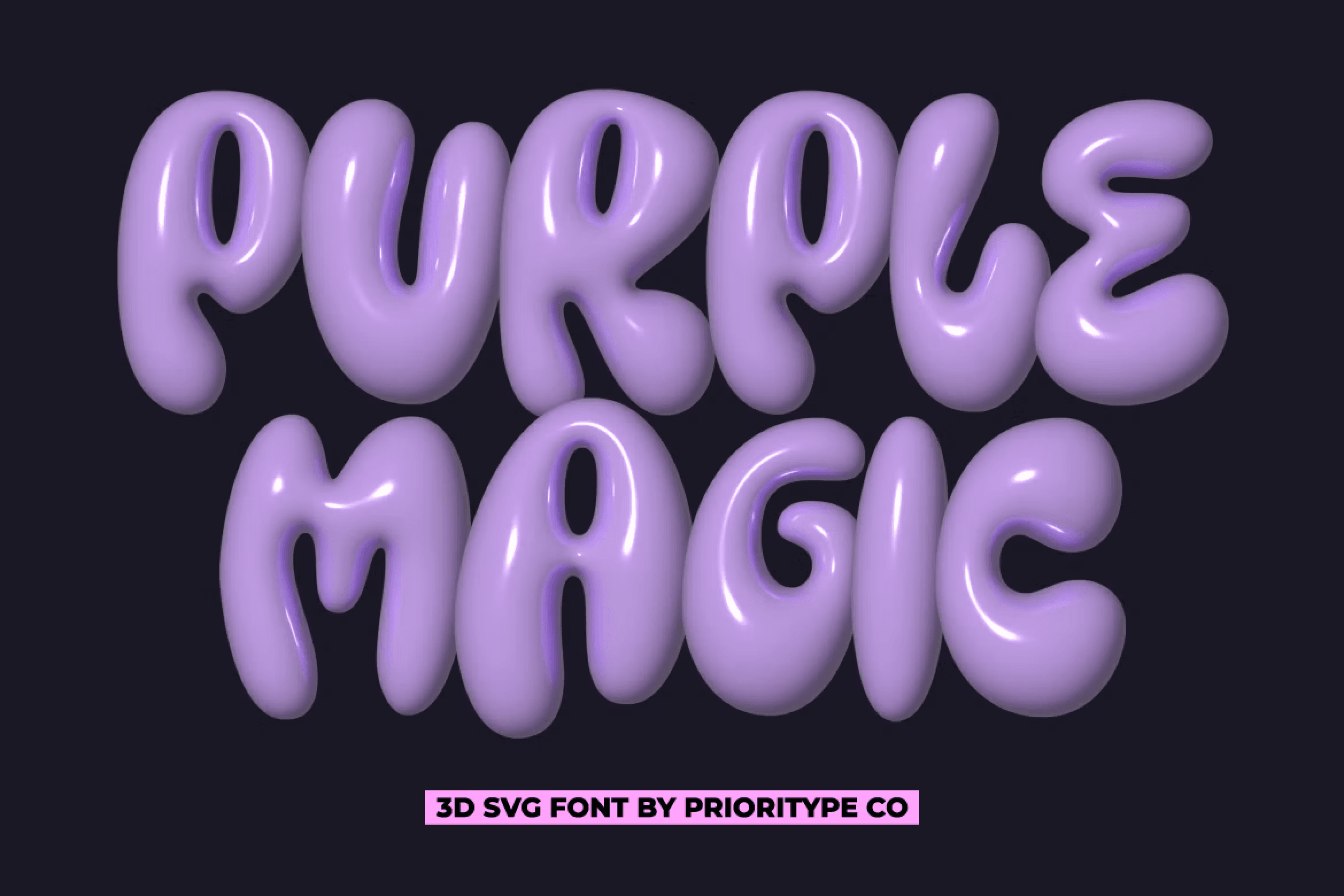
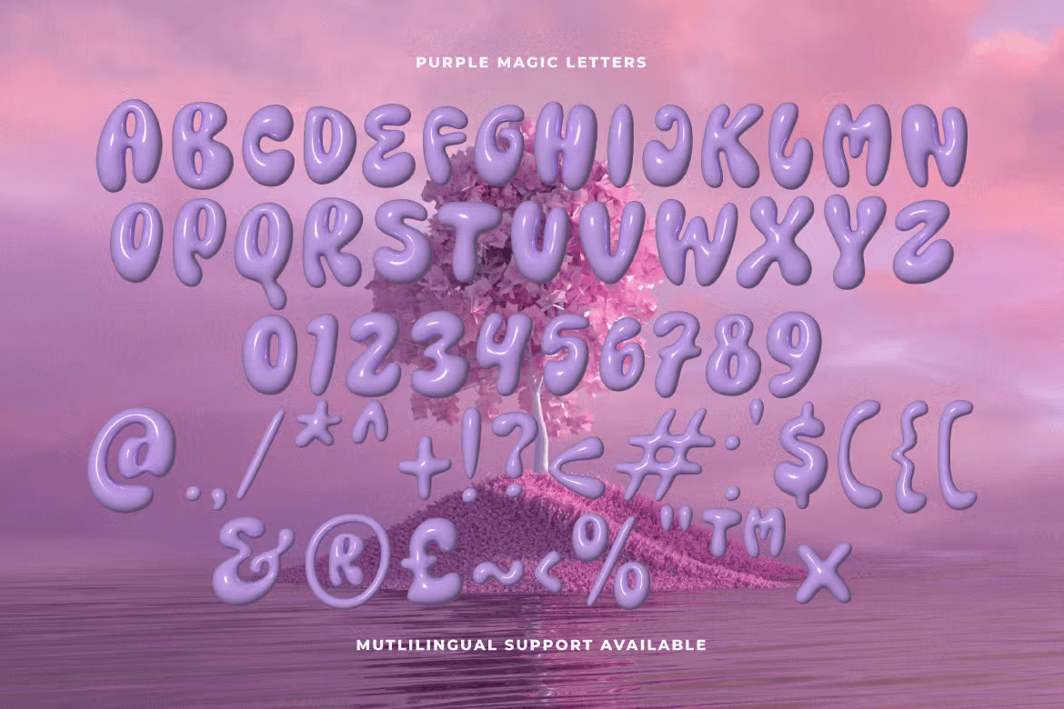
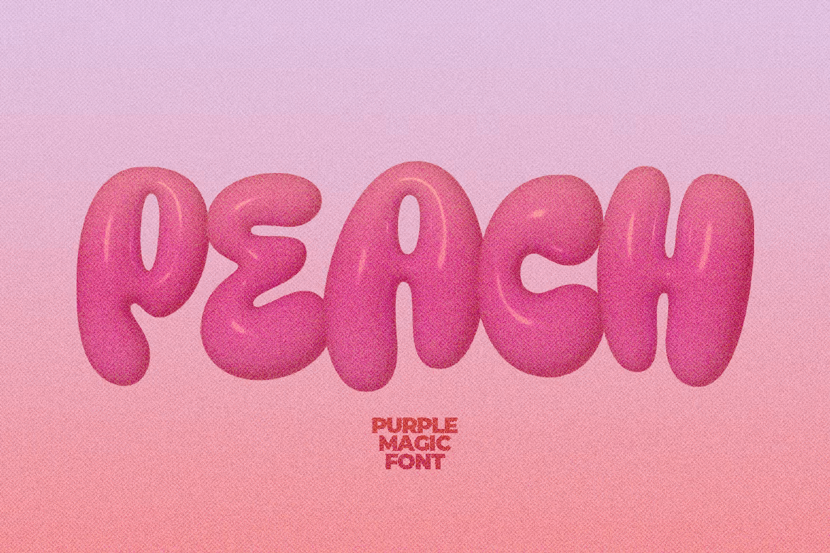
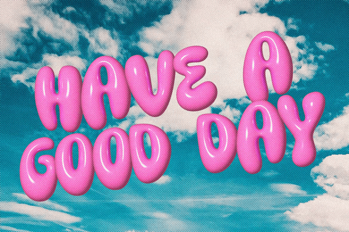
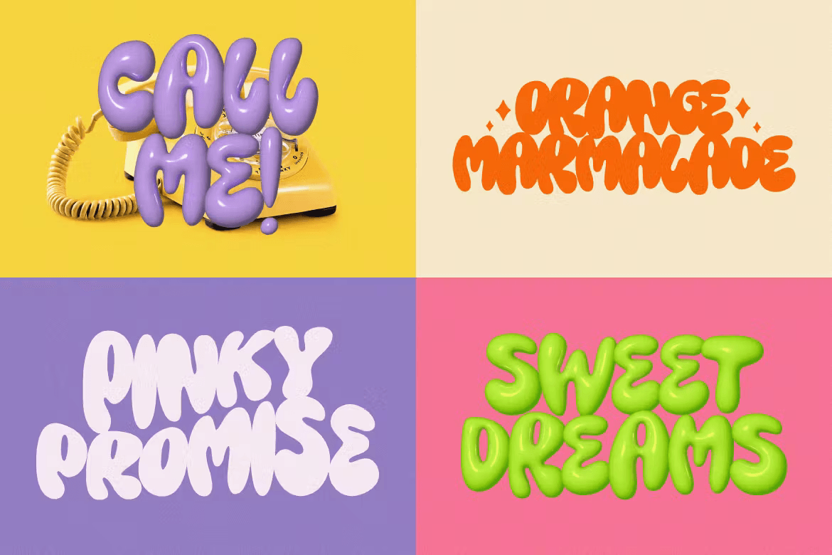
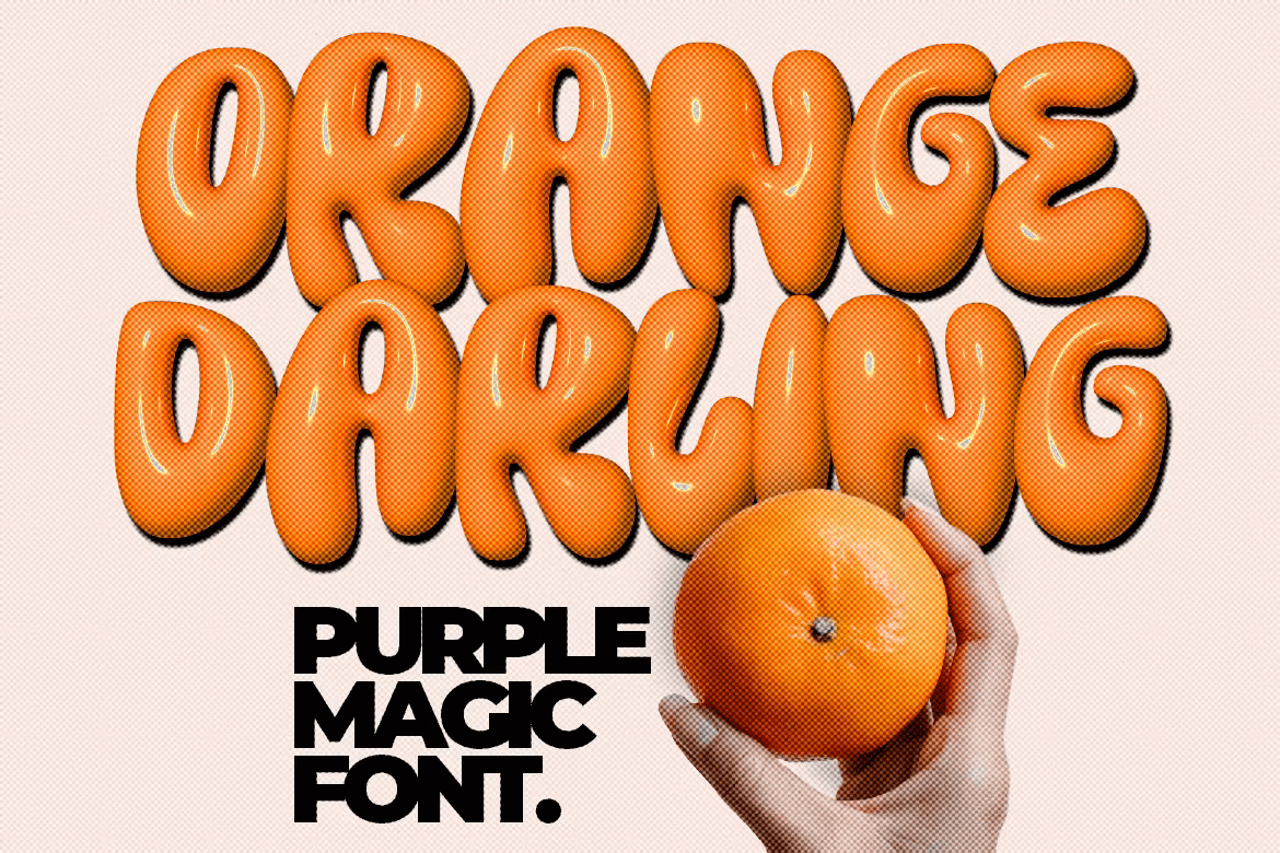
Purple Magic – 3D SVG Font by PrioritypeCo
What technical considerations do you keep in mind while working?
I usually use the shape of the letters to guide most of my technical decisions. That, and whether the end result is nice to look at and—of course—legible. That logic extends to decisions on special characters and ligatures too: I use the shape and vibe of the letters as my guiding path.
What is your favorite kind of font to design?
I prefer creating display fonts and serif fonts, as well as 3D ones the most. Why? Well, these 3 kinds of fonts all have the most to play with. They’re often the most unique and they include a lot more variation.
With any font I love creating alternative and additional characters. Anything that keeps it interesting!
In your experience, what are the most common misconceptions people have about font design?
Definitely how much work goes into creating a font. It’s not just sketching out each letter once! Creating a font takes a long time and takes a lot of patience and skill.
How do you balance aesthetic appeal with functionality in your font designs?
I love this question! I think that balancing the aesthetic and functional appeal of a font is actually quite fun to think about and discuss.
The main thing that a font has to do is be legible. That’s why I rely so heavily on my quality control process! After I have created and exported the font, I always try using it in various design programs to see whether it is appropriate in shape and readability.
Showing customers examples of the fonts in different contexts, like in logos or on posters or mockups is helpful to prove that it will work where they need it.
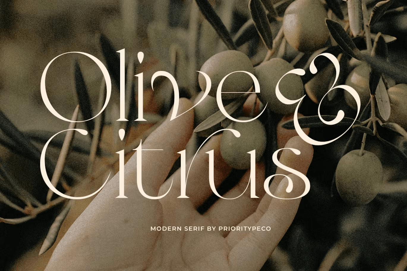

Olive & Citrus – Modern Serif by PrioritypeCo
Do you follow any trends in the font design space?
I think the trend in font design is still unclear. You could even say that I myself don’t think about trends. A good font that is popular with designers is already a trend in my opinion. Whatever the type.
What are your favorite fonts that you’ve produced on Elements?
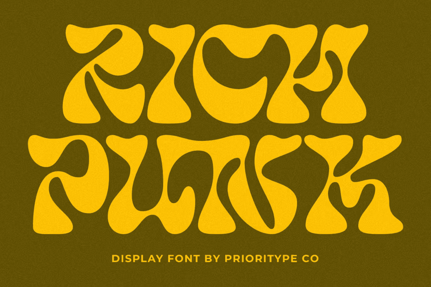
My favorite fonts that I have published in elements are Magilio, Rich Punk & Purple Magic.
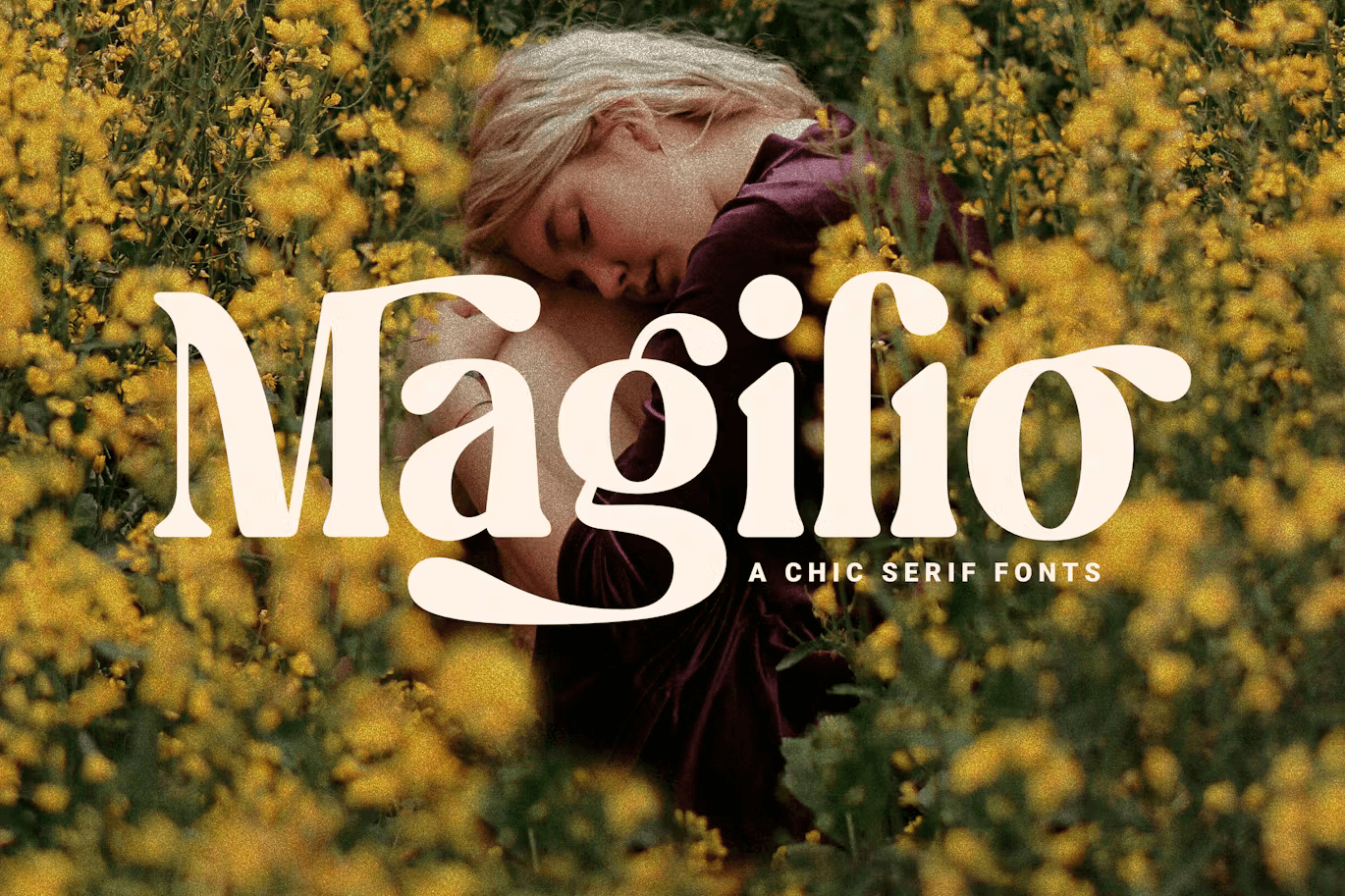

Magilio – A Chic Serif Font by PrioritypeCo
We hope you enjoyed hearing from PrioritypeCo, and learning more about the process of creating fonts. You can stay up to date with PrioritypeCo by following them on Instagram @Prioritype.
For more font-related content, check out these 10 fonts our team loved.
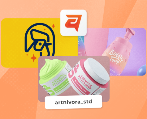
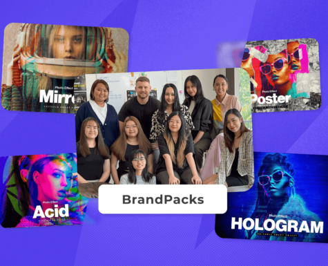
If you want to dive into more interviews with graphics Authors, then check out our chats with artnivora_std, BrandPacks, and IanMikraz.